Pages

Thursday, June 20, 2013

64: never apologize for selfies


Also from Tumblr. At the risk of hitting you over the head with this stuff, I'm just going to point out (briefly) why I love this whole post:
  • Understanding the culture of selfies (if you don't get it... sigh)
  • Rationalizing that culture from a hilarious art history angle
  • Connecting past & present and tying us all together
(via staff)

Tuesday, June 18, 2013

63: paint what matters


This is kind of an unintentionally silly ad by the Martin Agency (and Brad Pitt!) for Benjamin Moore paint. It hearkens back to the Dodge Chrysler Detroit story – same sentimental American voice (hey, Brad Pitt, why are you doing voiceovers for commercials now?), same push for Americana, same attempt at bringing a sense of heritage into the picture.


The kids over at mediabistro hate it, clearly. I find one comment particularly interesting though: "Shame to ruin the awesome style of those buildings with a fresh paint job." I tend to agree and wonder if corporations like Benjamin Moore give thought to things like that.

I mean... they're trying so hard to evoke a sense of timelessness, history, "the American way," and yet? In painting over the walls, aren't they erasing that timelessness, that history, that reminder of what it was like "back in the old days"? The concept is great: Hey, let's assert ourselves as a company that cares about America and Americans and community!

But does the execution really make sense?

Thursday, June 13, 2013

62: tumblr cult(ure)

Tumblr Tumblr Tumblr. Up until recently, it was the biggest thing you've never heard of – an odd thing to say, given that President Obama has his own account (and might I say, it's pretty darn great), not to mention countless other individuals that are huge in their own spheres: John Green, Wil Wheaton, Neil Gaiman, Queen Bey, Marina and the DiamondsZooey Deschanel... I'm lazy so I'll stop here.

Anyway, I bring this up because Tumblr is clearly a huge thing. Yet it's surprising how many people don't get it. Tumblr is constantly overlooked, with social media "experts" and "strategists" still hyper-focused on Facebook and Twitter and Instagram and Pinterest instead. (I've attended workshops and online seminars where the speakers don't even know what Tumblr is!)

So many of these agencies have underestimated the intensity of Tumblr users, and it's their loss, really. From my own experiences with Tumblr, a bulk of its users are actively involved with multiple fandoms, social causes, etc. and are proud of it. (Isn't this every brand's dream? To have the Engaged Target Customer?)

After Yahoo(!) bought out Tumblr a few weeks ago (cue sad violins), there was a flurry of activity surrounding the deal – i.e., lots of Tumblr users seriously concerned that Marissa Meyer was going to kill off their favorite website. Hank Green had some really great thoughts on the buy-out, so I won't go into detail there. What I do want to think about is the importance of maintaining your brand in the face of a big change like this.

David Karp wrote a letter to the Tumblr community, noting that:
Our headquarters isn’t moving. Our team isn’t changing. Our roadmap isn’t changing. And our mission – to empower creators to make their best work and get it in front of the audience they deserve – certainly isn’t changing... As always, everything that Tumblr is, we owe to this unbelievable community. We won’t let you down.
Fuck yeah,
David
(Emphasis mine.)

Like many others, I find it really important to highlight his sign-off because it is a reminder that although this sacred website has signed a deal with a huge corporate dinosaur, it doesn't mean that Tumblr will turn into something else. It's David Karp's way of acknowledging the Tumblr community's concerns. It's his way of almost drawing a line in the sand and showing us that he knows what Tumblr users are like – that he himself is one of them – and that he's on our side.

Wow, this got real sappy real fast.

I'm not saying that David thought through and calculated every word he was writing (I mean, maybe he was – who knows?). But my point is that there are ways for brands to assert their identities, to create a camaraderie between brand and user without it feeling forced. For Tumblr, it's about staying relevant and understanding the culture (think about all the Fuck Yeah! blogs that exist), as well as subtly affirming a sense of loyalty and therefore assuaging user concerns. Or trying to, at least.

So... cheers to that. May other brands learn from Tumblr along the way.

Monday, June 10, 2013

61: street art for sex workers

Been thinking less about "good ads" lately and more about (1) effective forms of communication and (2) effective ways of asserting your brand. The first, I'd like to touch on today.


These "ads"/street pieces for AMMAR, Argentina's association for sex workers, have been making the rounds on Tumblr for several weeks now. The thought behind it: "86% of sex workers are mothers. We need a law to regulate our work."

I like this particularly because it doesn't feel like an advertisement. It feels (and looks) like street art, which has been historically and traditionally – though that's another topic altogether – used to promote non-corporate interests. In other words, the interests of the people.

It's attention-grabbing and it's clever and it's honest. These pieces make you think about a controversial issue in a new way. It forces you to acknowledge that, like you, sex workers have families that they need to support and that, like you, sex workers deserve basic human rights.

AMMAR's goal is for sex work to be regulated by law, so that sex workers can be safe and protected from things like police brutality, sex trafficking, and other forms of violence. I don't care whether or not you agree that government should decriminalize sex work. I do hope, however, that you can recognize that strand of humanity that must necessarily connect us all, regardless of our choice of work. I am all for meaningful creative endeavors that play on empathy and compassion for people, and I think Ogilvy & Mather (Bs As) did a really great job here.

(via catsandgraffitis and Ads of the World)

Thursday, April 4, 2013

60: politics in advertising

My poor neglected blog. You deserve an overhaul.

In the past few years, my perspective on design, marketing, politics – and life, in general – have changed dramatically. Experience does that to you. Instead of evaluating programs and campaigns from a psychological perspective or a “digital” perspective (whatever that really means), I've been appraising them from more of a sociological standpoint.

In other words, I’ve been thinking about how they interact with Western values, traditional gender roles, inclusiveness, racism… It’s hard not to acknowledge these things, given the recent rise of more female-oriented media:
  1. Beyonce’s performance at the Super Bowl, which – despite the unfounded complaints of her naysayers – was perfect for so many reasons and which I should recap at some point, even though it’s already been a few months… but here’s an overview: empowerment, strength, and not a single man on stage
  2. That one guy (I can’t remember his name… Sam? Seth? Something – oh well, it’s not important) who gave an incredibly sexist spiel at the Oscars and rationalized it essentially by saying, “It’s just a joke”
  3. Lena Dunham’s Girls – critics have been hailing it as ground-breaking feminist work (I disagree; feminism means equality for all women and not just girls who are white)
  4. The Steubenville rape case and how every single mainstream media source framed as, “Oh, those poor boys/rapists… such a bright future ahead of them…”
I’m rambling, I know. And that’s really only the tip of the iceberg!

My point is that “political” issues have a heavy influence on the way people perceive advertising and media in general. Something that seems okay in theory may turn out to be totally freaking taboo in execution. I’m thinking specifically of JWT India and their disgusting Ford Figo ad, which was entered as a fake ad into India’s top awards show.

Clearly, a bunch of dudes in upper management had no issue with this blatantly misogynistic ad. Sure, it was meant to be a gag, but that’s the thing, isn’t it? We look at these voluptuous women who are bound and gagged and wearing bikinis, and we’re meant to laugh it off. And that’s just so wrong on so many accounts. For one thing, it’s not funny, period. We should never take that kind of thing as a joke, especially since it happens all the time. That’s not something you make light of – it’s a spit in the face.

Fortunately, we are at a point in time (at least, I think we are) where feminist discourse is a prevalent and ongoing part of our culture – where violence towards women is not tolerated (not as much, at least) and where men as an institution* are put in their place.

*I know there will always be men crying “MISANDRY!!! MAN-HATER!!! REVERSE SEXISM!!!” so here’s my unnecessary disclaimer and a quick and dirty lesson: Reverse sexism, by definition, does not exist. Obviously, not all men are eeeeviiiil. But men as an institution (“the patriarchy”) are oppressive and threatening, particularly to women and people of color. Recognize your privilege and instead of complaining to women about it, start changing the male-dominated culture.

Thursday, February 2, 2012

59: bon iver on grammys spot


Bon Iver "We Are Music" Grammy Spot from stereogum on Vimeo.

This is a neat little spot for the 54th Grammy Awards from TBWA\Chiat\Day LA. It's a little bit bizarre seeing Justin Vernon featured in a commercial... for the very mainstream Grammys, no less... but it's kind of nice and surprising and not something I would expect for an awards ceremony.

Actually, this Grammys spot is slightly reminiscent of the old 2008 commercials for Valspar (which I blogged about two-and-a-half years ago) and Whirlpool (I can't find the exact video I'm thinking of, but there's a lady with a bright flowing gown and a floating washing machine and there's soft, inspiring music playing in the background...? Oh, never mind. This sounds so ridiculous).

Anyway, my point is that all of these commercials are sort of earthy and flowy and surreal. It just goes to show you that advertising can be a form of art and a thing of beauty. More lovely videos below...


Valspar 2008 from Olivia on Vimeo.


"Climber" Valspar from SunTimes on Vimeo.

Sunday, January 29, 2012

58: the last 'oops' and rethinking the oreo

My last post was a semi-apology, a semi-update, and a semi-promise-to-post-new-content all wrapped up in one. I wrote it in July 2011, and now it's nearing the end of January 2012.

Oops. Again.

But this time I completely promise that this post will feature my last "oops, sorry I forgot to update" because there's lots going on in the world of brand, marketing, advertising, user experience, creative, digital, and more (look at all those buzz words!), and I want you to hear about it and to marvel with me.

So there's that.

Now that I'm done with announcements for the time being, I want to leave you with a story recently featured on NPR's Planet Money. It's called "Rethinking The Oreo For Chinese Consumers," and it's a prime example of rewiring a household brand and snack/cookie/treat (depending on what kind of consumer you are!) to fit another culture's usage behaviors and eating habits.

If there's one thing I've learned from: (1) my travels abroad in Taiwan, China, the UK, and Europe; (2) as an Information Science minor interested in the art and science of user experience; and (3) through my prior research experience at the Communication Department at Cornell... it's that you can't just "transliterate" words or ideas or products from one culture to another. Meanings get lost -- remember that urban legend about the Chevy Nova and how it no va ("doesn't go")? -- and tastes get confused. In an increasingly connected world, you really do need a deep understanding of the cultural and business environment in which you are going to operate.


In Kraft's case, the Oreo team in China had to reconsider what the Oreo cookie really is. Is the Oreo cookie all about the flavor? (Chinese consumers found it too sweet and too bitter.) Is it about the round circular shape? The black and white color? The Oreo team essentially had to identify the classic features of the Oreo cookie and figure out whether they even matter when considering international markets.

From the American standpoint, the Oreo cookie is a nostalgic, emotional experience. You have the ritual: "Twist, lick, and dunk." And it resonates with us. But it's kind of a weird thing. I mean, scraping off the cream with your teeth? Um... ew. (And yum at the same time! I can haz all teh Oreos plz?) How do you sell this quirky American thing to Chinese consumers?

According to the Oreo team, you use emotional advertising, apparently. With the help of Draftfcb, you get cute Chinese kids partaking in this weird American thing, and next thing you know, you've got sales skyrocketing and a very happy Kraft Foods.


Ah, the intersection of consumer behavior, market research, culture, branding, and marketing. Don't you love it?!

Next time: Some thoughts on Yum! Brands and KFC and their perfect egg custard tarts. Le swoon.

(via NPR and Kraft Foods)

Friday, July 8, 2011

57: oops...

Hi all. So clearly, clearly, I suck at the blog thing. I started an entry back in March, apologizing for how sucky I am at updating the blog - but of course I never ended up posting it because, well, I suck at updating the blog.

Some news: I spent this past spring term (January to end of April) in London, studying abroad and interning at an independent ad agency called Inferno. I learned a lot, saw a lot, met a lot of lovely people, and can say that without a doubt it was my best semester ever as a student. Now that it's summer, I'm home in Atlanta and interning at Newell Rubbermaid, which has been an educational experience on a whole different level, and filled with all sorts of perks, to boot!

I have a handful of posts in the queue, just waiting to be finished and published, but until then feel free to keep in touch on bee-co warrior (my foodie pet project) or Twitter!

Sunday, December 12, 2010

56: HCI and music

Yann Tiersen on six iPhones:


My church's worship team on iPads (skip to 5:00 to see Seth Condrey making good use of the T-Pain app):


Collective win, yes?

Thursday, December 2, 2010

55: a visualisation critique from my HCI design class

artifact: map your moves

Moritz Stefaner's Map Your Move visualization shows where New Yorkers have moved in the last ten years. His data comes from an informal survey of 1700 people, and because most of it reflects people moving from, to, or within the New York area, he uses that entire region as the focus of the graphic. All other parts of the world are mapped relative to New York City.


When you first go to his project, you see a bunch of brownish-purple circles of varying sizes. Each circle represents one zip code, and its size represents the number of moves to or from that zip code. He uses rings around circles to indicate which behavior is more prevalent (red = people moving out, blue = people moving in).


You can interact with the graphic by clicking on a circle to look at moves to/from the area, or you can drag your cursor to make a radial selection of dots that let you see a bunch of zip codes. Once you click on a zip code, all irrelevant dots fade away, and you see a bunch of red and blue lines, which represent each person's beginning and ending location, the year the person moved, and the reason why. There is also a side bar that shows general statistics for the zip code(s) you selected (# people moving in/out, reasons for moving in/out, when people moved in/out).

critique

Overview: The first thing that I always notice is aesthetics, so when Map Your Moves (MYM) loaded on my screen, I was a little grossed out because all these different sized dots reminded me of the measles. However, it's important for these circles to be different sizes because they show you at a glance where people are coming and going. Also, Moritz maps his graphic so that you can see other locations in the world, but he doesn't attempt to make his map geographically accurate (i.e., distances are disproportional), in order to make sure everything fits on the screen without having too much unnecessary extra space. It's nice that he considered this because it goes along with Fitts' law - bigger + closer = faster. The colors are nice as well, because the red and blue contrast nicely, and the background is very neutral and therefore not distracting.

MYM doesn't have very robust zoom and filter features. You can "zoom" in on a cluster of zip codes by making a radial selection of circles. However, it's not a very precise method at all. When you select a zip code area, the graphic automatically eliminates all other items for you, so you can see your current data points very clearly, but based on your goal, some points might be more important than others. The system may be too rigid in that respect.


Details on demand: MYM is fairly good at providing details; whenever you position your cursor over a circle or a line, the circle/line becomes outlined, and a text box with information pops up, which not only helps you maintain your orientation but lets you glean specific information very quickly. The sidebar is also useful in that it shows you statistics for your current selection area.


At first glance, it's hard to compare relative numbers, because the bar graphs for each variable are in the same line. However, the designer does include gray baselines when relevant, so you can easily see whether these numbers are actually statistically significant, which may be more important than positioning the bar graphs to appear more comparable.

redesign

Because the mapping is not to scale, it's hard to find specific zip codes. Most people only know a handful anyway (office, home, school), so in order to navigate, users really need to rely on trial and error. An easy fix would be implementing a search bar based on address. That way, users wouldn't have to know individual zip codes, or have to look through each circle one by one; they could type in a familiar street or nearby restaurant to navigate (similar to the way Yelp and Google Maps work).


There is also an issue with size. It seems that Moritz made tradeoffs in usability and ability to interpret and understand information. According to Fitts' law, bigger may be better, but in this case, actual circle size is a defining characteristic and relevant to the interpretation of data. Because the thin lines and small dots are hard to select, and because many of the lines overlap each other, it's easy to either select the wrong one, or miss it entirely and click on the white space instead (which actually clears your selection completely and takes you back to the overview). You could address this with a gravity function or a magnetic cursor so it's easier to jump from circle to circle or line to line. You could also add a history bar with the last several regions you looked at, to undo unwanted or accidental actions.

In Carr's paper, he says that visualization is designed to help people who are "pursuing a goal that is unknown to the designers and requires sifting through a lot of data," but that supporting specific tasks is also good. My goal was definitely unknown at the time - it wasn't until I actually started playing with the visualization that I realized I wanted to know why people were moving away from New York and where they were going. When I scrolled over lines, I'd see general reasons for moving ("Work or School," "Can't Afford What I Used To," etc.), but there were also people who wrote things like "building was being replace[d] by a 'luxury' condo," or "Neighborhood was scary," or "didn't like australia." To me, these are the little pieces of information that make data so interesting and help people relate to one another. I'd like to see a feature that shows almost the opposite of what this visualization currently does: Start with the why (reasons) and show where people moved. This could be as easy as making the reasons listed in the sidebar clickable; zip codes with people moving away due to roommate or relationship issues could vary with size.

Friday, November 19, 2010

54: the best sad winter/cheer up playlist ever


It's six songs, all the better to put on repeat.

Soft Shock (acoustic) - Yeah Yeah Yeahs
Twilight Galaxy - Metric
Moth's Wings - Passion Pit
L.E.S. Artistes - Santigold
All I Need - Radiohead
Past in Present - Feist

Friday, November 12, 2010

53: but it's only november

To all hipsters and "ironic" gift-givers:

The makers of Snuggie have caught onto you. And they're coming out with a Christmas ad campaign too. See below for a sneak preview:

Wednesday, October 27, 2010

52: runaway, kanye west


I love Kanye. I can't help myself. The phoenix that rises and falls... LOVE IT.

Friday, September 24, 2010

51: artsy-fartsy friday

A little over one year ago, I came up with this idea to have an "Artsy-Fartsy Friday" feature on this blog. I made one Artsy-Fartsy Friday post and then kind of proceeded to forget all about it for the next 365+ days.

So. In honor of what currently appears to be an annual feature, this post shall be a conglomeration of the fabulous music videos of the Chicago-based band, OK Go.

Let's start with their newest release -- this is for their song, "White Knuckles":


One featuring their awesome Rube Goldberg machine...


More stop motion (if you didn't know already, I have a thing for stop motion)...


Incredible choreography... This is the video that helped launched OK Go onto the Billboard charts.


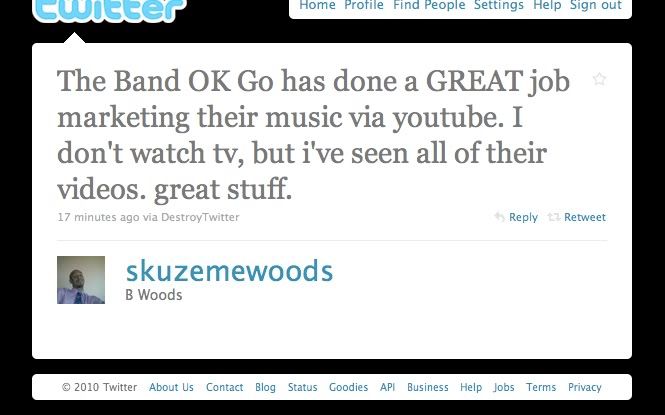
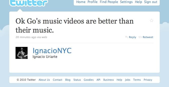
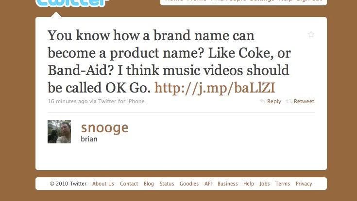
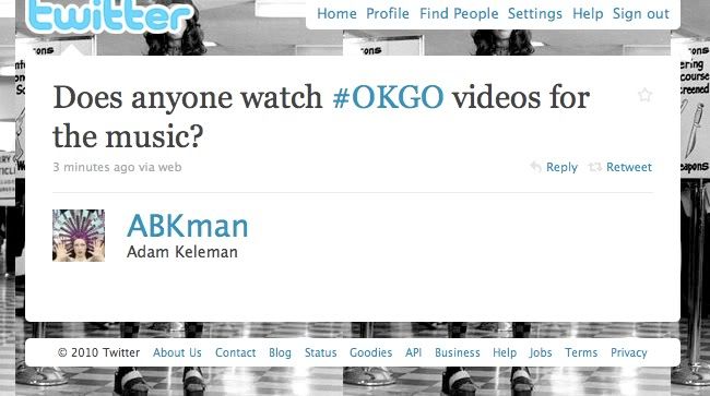
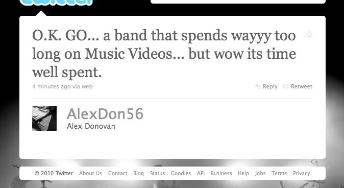
Public response, according to some of the things I caught on Twitter the other day:


(via)


(via)


(via)


(via)


(via)

Whether or not you love or hate OK Go's sound, it's hard to deny that they're producing really innovative music videos with some pretty groundbreaking ideas.

Wednesday, September 22, 2010

50: screencaps from love in the afternoon

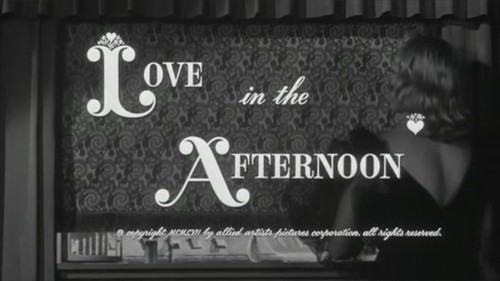
title - Love in the Afternoon

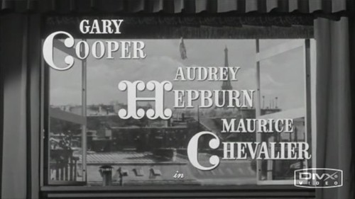
credits - Love in the Afternoon

Two screen captures of the opening credits from the 1957 romantic comedy, Love in the Afternoon (later released in Europe under the title Ariane). Keepin' it classy.

Friday, September 10, 2010

49: a critique on computer interfaces—chrome vs. safari

For those you who aren't in the know, Chrome is Google's new-ish web browser. It's fast, streamlined and simple, keeps you more secure on the Internet, and has other nice features. Now, I'm a Mac user, and for a long time I strangely took pride in my usage of Safari as a browser. None of that Mozilla Firefox or Internet Explorer nonsense—Safari all the way...until my former roommate introduced me to Google Chrome, that is. The first thing I noticed was how colorful her browser window was. Pink hearts and bunnies in the background? I'm sold. I've been using Chrome on my laptop for a few months now, and I've noticed some good and bad aspects about it.

the good

The themes, obviously. Sounds funny to say, but having a little color and a taste of your individual aesthetic in your browser makes your Internet experience that much more personal. Switching from Chrome to Safari actually feels like going back in time—shocking, I know. But Safari is just so monochromatic; I never want to stick around for too long for fear of all the gray and black sucking out my soul. With Chrome, it's also really nice not to have to download an add-on just to have browser themes (like you have to do with Firefox). It might seem like a tiny little 2-minute step, but it's still 2 minutes of my life that could be spent doing anything else. Google Chrome makes the whole process completely painless.


Easy access to recently closed tabs. Safari has a "Reopen last closed window" button, as well as a "Reopen all windows from last session," but sometimes you don't want to be constrained to either/or. Sometimes you want to see more than the last website you visited but fewer than the fifty that were open during your last session. Chrome gives you a lot more flexibility in that respect.


the bad

Unlike Safari, Chrome doesn't have a title bar at the top of the window. It's really annoying that I can't see the full title of the page I'm looking at unless I hold my mouse over the tab, and even then I shouldn't have to find a work-around for something so basic. The lack of visibility becomes a bigger problem when I have a lot of tabs open and I start accidentally closing out windows, not knowing what exactly I just closed. I'm sure there's a way to make the title bar visible, but that would take more work than I'm willing to exert. I don't know what would possess Google to remove such a standard feature from its browser, but I'm pretty sure it wouldn't take that much more time, labor, or effort to add it back in.

Speaking of title bars, I'm really used to double-clicking the title bar to minimize my browser window. However, since Chrome doesn't HAVE a title bar, I was caught off-guard the first time I tried to double-click my windows away. I kind of stared at the screen for a while before tentatively choosing a very thin sliver of window that wasn't occupied with a tab or some other button. Same goes for just dragging a window around your screen. It takes a lot more focus to aim your mouse because that thin strip of space doesn't really afford easy access.


Easy fix—add back the title bar and give users more leeway to grab onto the window. (Really, it's like killing two birds with one stone.)


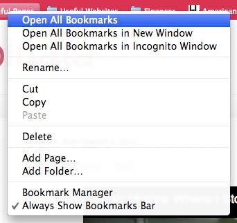
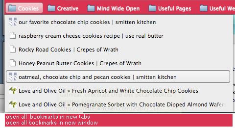
Not being able to open all my bookmarks at once. In Safari, I have the option of opening all the bookmarks in a folder with just one click, but in order to do so in Chrome, I have to right-click on the folder to see my options—this lack of visibility makes my gulf of execution a lot wider. In Safari, I'd use the "Open all tabs" feature like fifty thousand times a day, but because it's harder to see what to do in Chrome, I'm finding that a lot of the time, I just end up not using my bookmarks nearly as often.


Redesign suggestion: Add an "Open all tabs" option in the bookmarks folder, like Safari has. Or maybe even cater to us drag-and-drop aficionados, and make it so that you can drag a folder into the navigation bar, which will open up all the bookmarks in that folder.


the ugly

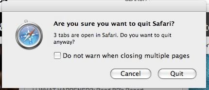
Weird secret hidden key commands. In both Safari and Chrome, Command-W is a shortcut for closing the current tab you're looking at. In Safari, Command-Option-W closes out all windows EXCEPT for the current tab you're looking at, which might actually be one of the dumbest shortcuts I've ever encountered, seeing as the Option key is RIGHT next to the Command key, which makes it so easy to accidentally close out all the wrong tabs, which I've done many times before because I have clumsy fingers. In Chrome, Command-Option-W just closes out EVERYTHING, which might possibly be even more irritating. Similarly, Command-Q closes everything out and quits out of both browsers—however, with Safari, if you have more than one tab or window open, you get a pop-up message. No such message with Chrome—if you accidentally Command-Q your way out of the browser, you lose everything and have to reopen all your "recently closed" tabs again. Redesign suggestion (or demand, really): Get rid of Command-Option-W. So useless and hazardous for the accident-prone. Add an alert for every time you press Command-Q, so that you don't accidentally/blindly quit out of everything you're looking at.

Monday, September 6, 2010

48: mixtape - fall


No album art or downloadable tracks this time -- just something to listen to while you're doing stuff on the Internet.

Tracklist:
Where I Stood - Missy Higgins
Where We Gonna Go From Here - Mat Kearney
Breathe - Taylor Swift
Buildings & Mountains - The Republic Tigers
Brown Trout Blues - Johnny Flynn
The Lengths - The Black Keys
Sleep - Azure Ray
In These Arms - The Swell Season
You Could Be Happy - Snow Patrol
How to Say Goodbye - Paul Tiernan
9 Crimes - Damien Rice
Lies - Glen Hansard and Markéta Irglová
Moon and Moon - Bat for Lashes
I Will Follow You Into the Dark - Death Cab for Cutie
Make This Go On Forever - Snow Patrol
Won’t Back Down - Mat Kearney
The Park - Feist
Bird Song Intro - Florence + the Machine

Thursday, September 2, 2010

47: a critique assignment for which i got called out for not addressing aesthetics

artifact

I'm looking at a Poland Spring's Grip-n-Flip water bottle, available at most convenience and grocery stores for less than two dollars. As far as water bottles go, this one designed fairly thoughtfully (although I did encounter some issues with the flip cap).

good elements

Poland Spring's Grip-n-Flip design differs from other water bottles in that the bottom half of the bottle curves in slightly and has textures and grooves that are supposed to help users grip the bottle more securely. The little textured bumps and lines don't actually help me hold onto the bottle that much better; if anything, the two textured sides of the bottle add a level of comfort to holding the bottle (it's almost like a massage for your fingers), and improve visibility by indicating more clearly where I'm supposed to put my fingers (in contrast, the rest of the bottle is relatively smooth). This bottle also has really nice affordances - two of the curved sections on the side of the bottle have three very subtle indentations, a perfect fit for small semi-cylindrical objects, like your fingers.

Another nice thing about this bottle is that it has a flip cap (as opposed to a twist cap) that makes it much easier for the user to drink water on the go. The flip cap's clear blue color stands out and makes it very visible to the user that it is probably an important feature on the bottle. The cap has this slight ledge that possibly affords wedging something into it - in this case, if you put your finger under it and apply a little pressure, the cap opens easily.

bad elements

If you're not used to drinking from a bottle with a flip cap, then there's probably a learning curve. It's not obvious that you have to push open the cap to drink water because there's not really a natural mapping to it; in fact, Poland Spring even lists instructions for opening and drinking from the bottle on the label because it's not intuitive. Another element that sucks is the fact that the cap pops open SO easily - whenever I have this water bottle in my bag, I have to make sure it's standing upright because it has a tendency to snag on my notebooks and leak water all over my belongings, which is really, really irritating and a definite liability.

other stuff

Of course, in my critique, I'm ignoring aesthetics (I actually prefer a smooth sleek water bottle - picture VOSS and smartwater - to one that is textured and somewhat unusually-shaped), as well as cost/sustainability (apparently Poland Spring's bottles are supposed to be really eco-friendly... less plastic is used, which means the bottle is thinner than most and more flexible, and flexibility affords bending and crushing, which is good when you want to recycle stuff, I suppose). There's also the fact that my Poland Spring fits nicely into a cup holder on a car, which is more than can be said for those square FIJI water bottles...

redesign suggestions

The label on my water bottle says, "The easy grip sports bottle from Poland Spring is designed to fit naturally in your hand, and in your life," and I think the first part is true... the latter, not so much. Some easy redesign fixes - first, add a small bar of plastic in between the cap and the mouthpiece so that there's more friction to keep the cap from accidentally being jostled and opening. Second, instead of making the "ledge" go all the way around the cap, designers could cut off part of it so that the user has a clearer idea of where exactly to push to open the lid. The smooth dip in plastic seems to be the perfect size for a finger to slide along; that simple little detail guides the users movements and actions very nicely.

As far as helping the user grip the water bottle better, Poland Spring could add bumps that are more heavily textured or made from a different material, or even add a handle, if they wanted - though some people might consider this too bulky an addition. In general, implementing these design ideas probably wouldn't cost a ridiculous amount, but it would make the product better and maybe more valuable to the user.

Tuesday, August 10, 2010

46: this post is dedicated to kanye west


New video directed by Marco Brambilla. It's beautiful. One of the WSJ blogs has posted a lovely interview with Brambilla here. "It's not a video .. It's a moving Painting!!!" (via)

And here are some older but still fabulous artistic endeavors involving Kanye West:


Short film in which Kanye West portrays a drunk version of himself and then dies at the end. Directed by Spike Jonze. (Yeah, I know.)


Video for "Good Morning," produced in collaboration with Japanese artist Takashi Murakami.


This whole song is beyond stellar simply because, well, Daft Punk. Duh.


One word: Typography.

Tuesday, July 27, 2010

45: mixtape - dog days vol. 2

dog days vol. 2 album art

Download (.zip): http://www.mediafire.com/?rh78ra2oloz3nzk

It is with great pleasure that I bring you the second installment of my summer playlist, featuring Johnny Flynn (le swoon... Purchase his new album, Been Listening when you can -- it's divine, I tell you! Divine!), Jessica Lea Mayfield (she has an amazing track record including a recent performance on A Prairie Home Companion, and she's only twenty!), and my British husband Bobby Long. Includes 16 songs that add up to just over an hour of absolutely fabulous sounds. May it prove to be excellent background music as you carry out the remainder of your dastardly/non-dastardly deeds.

Download (.zip): http://www.mediafire.com/?rh78ra2oloz3nzk

Tracklist:
McFearless - Kings of Leon
Stained - Blue Foundation
Blinding - Florence + the Machine
I'm On Fire - Bat for Lashes
Left to Lie - Bobby Long
The Lengths - The Black Keys
The Wrote & The Writ - Johnny Flynn
Various Stages - Great Lake Swimmers
I Don't Mind - Marcus Foster
The Bucket - Kings of Leon
Drumming Song - Florence + the Machine
Arizona - Kings of Leon
Hey Ya (acoustic) - Mat Weddle
Kiss Me Again - Jessica Lea Mayfield
Good Love - Bat for Lashes
Dog Days Are Over - Florence + the Machine

Download (.zip): http://www.mediafire.com/?rh78ra2oloz3nzk

Side note: I realize that most of the artists in this mix are tied someway or another to a certain vampire-related franchise, which skeeves me out a tiny bit... but it's also kind of reassuring to know that my aural aesthetic is evidently satisfactory enough to warrant some sort of entry into the world of OSTs. There may be hope for me as a soundtrack designer yet.