As we all know, poor design exists everywhere. Sometimes things are designed ugly, which is unfortunate, but still tolerable. Other times, things are just really badly conceptualized, and that is another issue altogether.
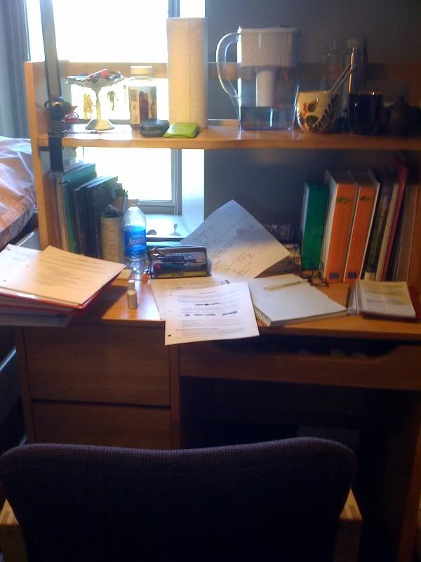
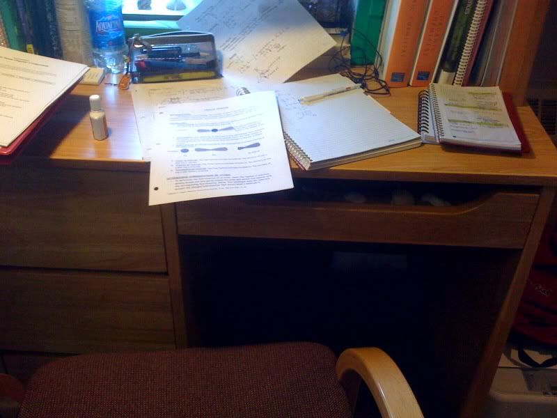
My roommate Alice thinks that her desk in our shared room in Cascadilla Hall is one very pertinent example of horrible conceptualization. When Alice does work, she's always got books open to her left and right, with handouts, notebooks and papers everywhere in between. However, her desk in Cascadilla makes it hard for her to use all her desk space, in the way that she needs to use it.
Alice: "I wish the space under the desk were bigger. I want to use the entire desk. They give you all this room to work, but since you can't move your chair very far, you can't even use it."
The entire smooth, level, wood surface of the desk affords holding materials and being written on, but the mapping of the desk makes it so that you can't even access that space effectively. The space beneath the desk affords putting your chair and legs into it; but since it's positioned under the right half of the desk, once you're sitting in the way that the design “forces” you to, you realize you can only comfortably access the right side of the desk. You really have to crane your body and neck in order to reach and see whatever notes/textbooks you put on the left side of the desk.
Alice's current solution is simply to move her chair to the center of the desk, even though it doesn't fit. It's not very comfortable, and she resents how the space beneath the desk acts as a "forcing function" that designates the way she manages her workspace. She doesn’t understand why she should have to cater to the design in the first place.
The desk is an everyday object she has to deal with. To the designer, it's probably just a simple, standard dormroom desk, but to Alice, its poor design makes it a hassle to use. There seems to be a gap between the designer's mental model of how the desk should be used, and Alice’s mental model.
However… based on what Donald Norman has to say about designers pleasing their clients (who may or may not be the end users themselves), I suppose this issue of poor design is, in a way, to be expected. From a practical point of view, if they got rid of the drawers and just left an empty space for you to move your chair as you like, students would inevitably complain about not having enough storage space in their desk. If they moved the empty space to the middle and had drawers on either side, the desk would inevitably have to be larger, to accommodate an appropriate drawer size and an appropriate chair size... and let's be real -- buyers for Cornell housing know that if our desks were any bigger, they wouldn't fit in the room at all. Unfortunately, it's just like being stuck between a rock and a hard place.
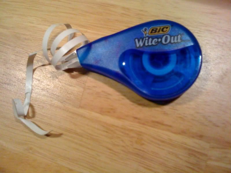
Over the past two years, my pencil usage has dropped significantly... These days, the only writing instruments I ever use are black or blue pens. However, seeing as I am a complete neat freak when it comes to taking notes, my exclusive use of ink leaves me in a bit of a mess, making my BIC Wite-Out correction tape an absolute necessity for me.
For starters, it is physically constrained by the amount of correction tape in the dispenser, 33.3 ft. The correction tape spool cannot rip, either, or else the entire object will no longer function. The actual shape also molds its use. To operate it, the tip has to be held at an angle, with constant pressure applied to it, and on flat paper, as it doesn’t really adhere to plastic or anything particularly textured. Furthermore, once you white-out something, there’s no way to “undo” it, so you have to be sure you want to get rid of the text in the first place.
Defunct BIC Wite-Out tape
Cultural constraints: Our current generation knows the use of correction tape because it's been around for so long -- since the age of typewriters and fax machines. We understand that it’s not meant to be used as actual "tape" to hold things together, nor for entertainment purposes (see video below). It exists to cover up errors made with ink -- mistakes that are otherwise un-erasable. Additionally, culture advises us to use correction tape on white paper, so that it doesn't stand out on the page. Similarly, you also don’t want to use your Wite-Out TOO much because then your paper will look messy and un-presentable.
Wite-Out tape on a fan...?
For those of us who rely primarily on virtual measures for taking notes and writing papers, the "delete" key on keyboards is an alternative method for correcting content.
It is physically constrained by the actual, tangible object itself: The delete button must be pressed down on -- it certainly doesn't afford much else.
From a virtual perspective, however, its use requires that you have a text box open. Otherwise, it won't function like you want (e.g., if you have an Internet window open, and you’re not typing in a text box, but you press the delete key, the Internet window will return to the previous page you were viewing, rather than remove text). Also, the text document cannot be "read-only" -- you need to be able to actually edit it.
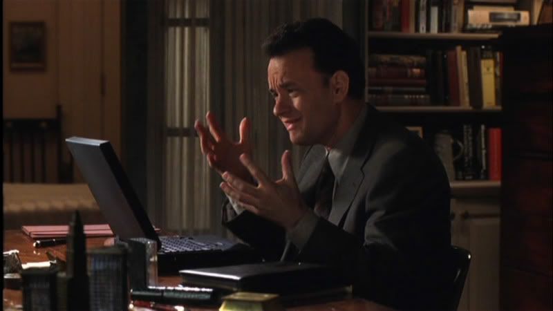
Cultural constraints of the delete key include the “delete” label on the key, which explicitly indicates its function -- we understand this meaning through our knowledge of language. From our observations and understandings of culture, we also know that holding down on it allows for a continuous stream of deletion, whereas repeatedly pressing down on it deletes characters individually. We also know not to pound on the delete key over and over, because it makes a racket, and people will stare or find it disruptive (remember the scene in “You’ve Got Mail” where Tom Hanks doesn’t know how to respond to Meg Ryan’s email? He keeps coming up with different things to say, but ends up deleting his emails letter by letter, in annoyance).
Physical constraints as applied to virtual objects are tricky since the actual constraints are themselves only virtual and not self-evident. However, in the virtual world, you have outs that aren’t necessarily present in the physical world. For instance, when you accidentally delete something, you often have the ability to “undo” your action and recover your text, whereas if you accidentally Wite-Out something, you might forget what it is you just corrected, and lose that information forever.
Also, unlike Wite-Out, the delete key allows you to make as many mistakes as you want. The final, clean copy will not expose any of your deletions/mistakes. This influences the way we use each object, because if you’re writing a paper by hand, you’ll probably take more time and care into composing your thoughts, to keep from making mistakes while writing. When typing, though, you’ll probably work more quickly and less watchfully, because you’re under the assumption that you’ll be able to easily alter the text later.
"Artsy-Fartsy Friday" is an idea taken from Mr. Madden, my former almost-art teacher in high school. Every Friday, he'd show off something "artsy-fartsy" -- his words, not mine -- that he liked. Once, he played a clip from "Eternal Sunshine of the Spotless Mind" (the one where Joel's memory literally starts to crumble); another time, it was an indie musician that he'd found... Basically, the point was to expose us to different artists, styles, concepts, techniques -- you get the picture.
I want to do something similar here. So, for the first Artsy-Fartsy Friday of Father Piñata, I'd like to present to you...
Great Lake Swimmers!
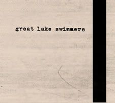
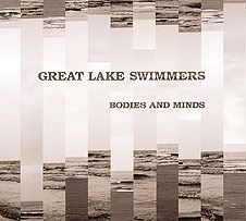
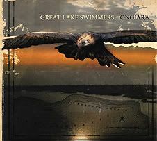
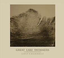
Canada-based Great Lake Swimmers is the brainchild of singer-songwriter Tony Dekker, and could be genre-ly (ha) described as indie/folk rock. To date, the band has released four full-length albums: Great Lake Swimmers (which was recorded in an abandoned grain silo in southern Ontario), Bodies and Minds (recorded in St. Theresa's Church in Ontario), Ongiara (recorded in the Aeolian Hall in Toronto) and Lost Channels (recorded all around the Thousand Islands region in New York, including Singer Castle). All of these albums -- with the exception of Lost Channels, which I have not yet had the pleasure of hearing in its entirety -- are wonderful and very easy to listen to.
Now, reviewing music is not exactly my forte, but I absolutely adore this band, and cannot bear to leave you with simply "indie/folk rock," or "easy to listen to," so I will do my best to elaborate:
Listening to Great Lake Swimmers is like filling your soul with soft, folksy lullabies and simple yet starkly intimate lyrics -- much like waking up to a cloudy day, a cup of coffee and an empty bed. It's the day after your best friend moves away, and you find yourself wandering the neighborhood, looking at things on your own, seeing things you never really saw before. Like drinking chocolate milk and eating a grilled cheese sandwich with Dijon mustard and apple slices. Walking barefoot on carpet and hearing your feet slide across the floor; or perhaps sitting cross-legged on your bed, cutting out construction-paper hearts while the heater is humming behind you...
I know this description does little in the realm of "evaluating" Great Lake Swimmers. It doesn't describe the music, or the style, or the words Tony sings... but I figure, hey, if you want straight reviews, you can find them easily enough. Finding visuals, memories, concepts of how things sound, on the other hand... not so easy to come across. And if we're being perfectly honest, sometimes a vision carries more weight than words do. In the words of a couple of Cornell professors, language is complex and constrained by an awful lot of things. And so I leave you with some words, but also with images, sounds and other media to append to your vision of Great Lake Swimmers.
These are the covers of Great Lake Swimmers' four albums. To me, they are quite reminiscent of a high-school geography book. You know, kind of used, worn and torn, creased, crinkled, a little bit of heritage and history. I like how rustic and unassuming they are as a whole, also. Plainly stated, the album art does a great job of accurately representing the sound and feel of the music.
"And the words tumble out of your mouth / like apples from a wild tree. / Mine, they spy out cautiously / like a creature from its cave... / My body aches for you, / and shakes for you, / sways for you, / and dances with your little woman body / long into the evening."
Earlier tonight, I was thinking about some things I miss from home, namely a user-friendly kitchen, and easy access to Food Network so i can watch all my cooking shows. (Sure, I have cable in my dorm, but do I really want to try and navigate the 50 gazillion channels and 23948923 buttons on the remote? Yeah, not so much... but I suppose that's another post entirely.)
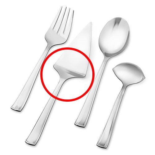
So anyway, all this ruminating about food, and kitchens, and user-friendliness got me thinking about the plethora of completely useless kitchen gadgets that are on the market... which in turn led me to the subject of this post: the overrated, under-criticized cake knife.
Seriously, who came up with this thing? You're supposed to be able to cut a cake with it AND use it to serve, but I'm convinced that not even the Food Network chefs themselves could properly and effectively work this thing. Let's take a closer look.
As far as affordances* go, you could say that the dull handle of the cake knife affords holding or grasping. The stainless steel affords applied pressure and getting dirty without being damaged. The pointed tip affords making holes and incisions. The serrated edges afford cutting, or at the very least, nicking a material. The slight dip between the handle and the blade affords supporting and leveraging or lifting... The functions of each element in the design are pretty intrinsic, I think.
However, while the cake knife's simplicity is a nice break from more complicated designs (such as the monster ultra-remote in my dorm), it allows for way too many conceptual models that differ from the actual, correct model -- for instance, the cake knife pictured above almost resembles a gardening or digging tool. People in other cultures might see it as some type of weapon. There are really just too many possibilities for its use.
Also, visibility† is pretty minimal -- no buttons, labels, controls or blatant indications as to how to operate the thing -- but I suppose that comes with the territory. It is a very simple serving tool, after all. In fact, because it is so simple, the minimal visibility doesn't seem to be too much of a problem. As Donald Norman says, "When simple things need pictures, labels or instructions, the design has failed." I do have to point out, though, that lack of visibility can become a bigger issue when cake server designs get more and more... flamboyant. (one, two)
There is, however one thing I really like, and that is the shape of the cake server. You'll notice it's kind of triangular, which suggests that whatever it holds should be a similar shape as well. By taking advantage of the natural design of the cake knife, the user has an immediate understanding of what the slice of cake should look like when she uses the knife.
Unfortunately, though, the handy triangular shape is not enough to redeem the design as a whole, because overall, there is not ENOUGH mapping‡ to suggest what you can actually do with the object.
Let's say you cut the cake and slide the cake knife under it so that now your slice is sitting on top of the server. Okay, then what? You can slide the knife back out; and if your cake comes out in one piece, and if the shape generally fits the server, you can tell that you've properly cut it. Instant visual feedback§, right?
But how do you get the cake off the server without unceremoniously dumping it onto its side and making a hot mess? It's not really possible, unless you grab a fork or use your finger to leverage it onto a plate... and doing so would simply defeat the purpose of a cake "server" anyway. Not to mention, there's a sanitation issue in there somewhere. Ultimately, there is just no mapping to suggest any other way to operate it.
So in conclusion, down with the traditional cake server! I think these people are of the same opinion...
Here’s a brilliant, simple solution to the problem:
(I love the comment on the Vimeo page, about how the guy doing the demo "can't help but laugh at how simple the product is, and how rich he is going to be." It's so true -- in a technology-laden world, simplicity slips our minds... which is quite ironic, since simplicity tends to be the one thing we really need more of.)
*affordances = "perceived & actual properties of how a thing could be used" †visibility = making controls "visible" to lead to easier use ‡mapping = relationship between two things (e.g., controls & actions) §feedback = information sent back to user to reflect effects of an action
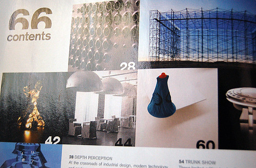
Blog. Oh, blog. How I long for the days of summer, when I could update every other day -- twice a day, even, if I was so inclined! Alas, attending class takes precedence, which leaves me with maybe-weekly updates. What I have for you today is Surface Magazine.
Surface Magazine, a really progressive-thinking print publication with an emphasis on style and design, comes out six times a year, and is a wonderful source for design inspiration.
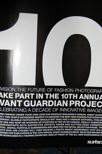
One thing that immediately stood out to me the first time I saw the magazine was its distinctive text treatment. As a play on the idea of "surface," the magazine constantly "trims" the type a little bit (you can see what I mean in the first and third pictures I posted). It's not a design element I commonly see, but it's definitely dynamic -- keeps things interesting.
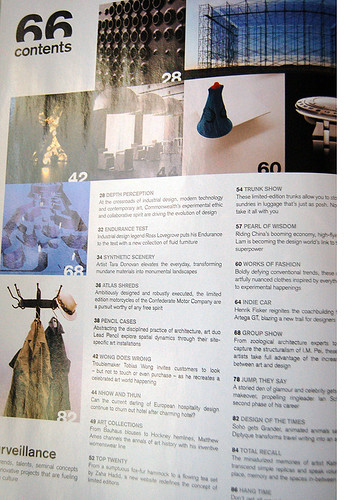
Also just wanted to point out the neat table of contents layout (fourth photo) -- I always pay attention to little structural and organizational elements, as I think it's the small details that really pull an entire magazine/layout together. Readers might not consciously notice whether or not the minor details (TOC, masthead and so forth) are consistent with the feature pages, but if they're totally divergent, you'll leave 'em with a weird taste in their mouths. People appreciate consistency, even if they don't recognize it.
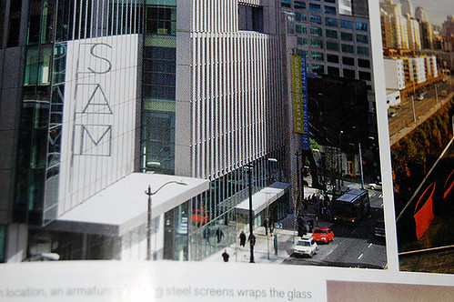
One final thing to note: I'm kind of in love with the "unexpected" text in the second and last images, i.e. the "hotel" sign and the wall type. Very cool to see designers playing with typefaces and lettering in real-life, non-print applications.
See the rest (as well as an archive of previous magazine shots) on my Flickr (click), and be sure to check out Surface Magazine's website -- they feature a lot of really neat and beautiful, contemporary designs (click).