Pages

Saturday, August 29, 2009

11: posters from portland center stage

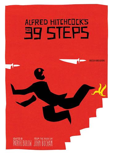
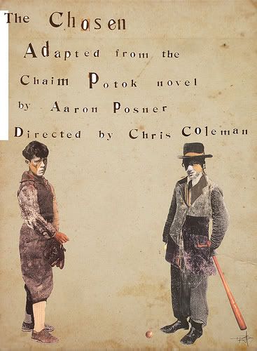
Just a short update, but since I plan on moving to Portland, Ore., someday, I thought I'd point out something pretty: new-ish poster designs from Portland Center Stage!


Designed by Kris Hargis


Designed by Andrew Holder


Designed by Lee Moyer

I love the first one ("The Chosen") for its cut + paste quality. It feels a bit folksy, and internalized, and dated, which of course, is perfect, given the subject of the poster. You can see more designs on their Flickr page (link) -- they're super nice, and very graphic-looking. Lots of brushes and interesting type... the Alfred Hitchcock one, especially, haha! Classic.

(via Portland Mercury)

Wednesday, August 26, 2009

10: kumon sux!!#$@!!%!!!!!

Kumon. You know you're Asian if you see these five letters and shudder.

Kumon is every Asian kid's personal hell. Protocol demands that if you're not already spending your Saturday morning in Chinese School, you must go to this little building often located in an Asian shopping center and do math worksheets. By yourself. To, you know, understand stuff better, or to get a head start on studying for the math portion of the SAT, or to drill "3 + 2 x 4 = 11, not 20" into your head.

Fortunately, I've never been sent(enced) to Kumon, though my sister played that hapless role at the ripe old age of 12, perhaps 13. (I imagine that, had I been propositioned to go, another sort of personal hell would've been in the making... Ha, just kidding. Maybe.)

Anyway, that was roughly 1995. Now, it's 2009, and Kumon has received a bit of a makeover since then...

Then:
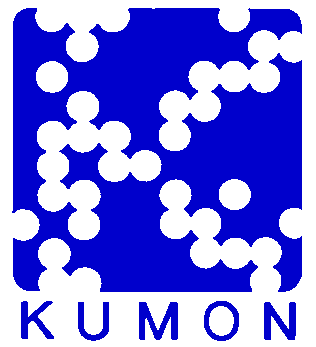

Now:

The new trademark is kind of cute, huh? It's pretty simple, with the sky blue and a clever little face embedded in the name... Significantly more streamlined than the old logo with the awkward, clashing royal blue-and-white color combination, and the creepy dot pattern that kind of reminds me of a disease (no pictures to illustrate my meaning, but you could always do an image search for "measles"). Apparently, Kumon's new logo is referred to as the "thinking face" and represents that of both children and adults. The sky-blue color is supposed to represent human intellect, integrity and earnestness. Erm, okay. (via Wikipedia)

Kumon, your logo may be more modern and way less passé than before, but the "o" ain't doing NOTHIN' for you... especially when said "thinking face" looks more like an "I'd rather gouge my eyes out with a dull spoon than be here, at Kumon, on this Saturday morning" face. Or maybe it's just a "meh" face. Yes, I think that's it. Meh. I mean, come on. Nothing says "WARNING, WARNING, AVOID AT ALL COSTS" like an unamused expression on a chubby face! Seriously.

So, I guess, on second thought, maybe Kumon hasn't really been that made-over... Maybe the logo is completely accurate and appropriate, after all.

All right, I'm not entirely serious about all the Kumon hate. Personally, if I had gone to Kumon, I probably would have liked it. I actually sort of have a thing for algebra and calculus...
Monday, August 17, 2009

eight: branding for a better world

Two weeks ago, I ordered a few books from my favorite, favorite online bookseller, Better World Books. The reason I love buying from BWB is because they have great customer service, and they always make my online shopping experience so enjoyable.

First, a little background for you: BWB sells both used and new books online and donates a percentage of the revenue to fund literacy foundations all around the world. You get carbon-neutral shipping -- free within the United States (loves it!) and great prices (my past purchases have been roughly less than a third of the original selling amount). BWB calls itself "the online bookstore with a soul," and with a three-part economic, social and environmental mission statement, that's pretty much the truth. (via Better World Books)

The company also runs a very personal business. I'm not saying they call and chat you up in the creepy, please-please-please-don't-ever-talk-to-me-again way... but they do inject personal touches wherever they can. For example, when you order a book, the company sends you a follow-up/confirmation email, signing off with "Your friends at Better World Books" (aww! Professional and endearing)... and this time around, I got an adorable little shipment notice. I'll post it for you here:


Hello Tiffany,

(Your book(s) asked to write you a personal note - it seemed unusual, but who are we to say no?)

Holy canasta! It's me... it's me! I can't believe it is actually me! You could have picked any of over 2 million books but you picked me! I've got to get packed! How is the weather where you live? Will I need a dust jacket? I can't believe I'm leaving Mishawaka, Indiana already - the friendly people, the Hummer plant, the Linebacker Lounge - so many memories. I don't have much time to say goodbye to everyone, but it's time to see the world!

I can't wait to meet you! You sound like such a well read person. Although, I have to say, it sure has taken you a while! I don't mean to sound ungrateful, but how would you like to spend five months sandwiched between Jane Eyre (drama queen)and Fundamentals of Thermodynamics (pyromaniac)? At least Jane was an upgrade from that stupid book on brewing beer. How many times did the ol' brewmaster have one too many and topple off our shelf at 2am?

I know the trip to meet you will be long and fraught with peril, but after the close calls I've had, I'm ready for anything (besides, some of my best friends are suspense novels). Just five months ago, I thought I was a goner. My owner was moving and couldn't take me with her. I was sure I was landfill bait until I ended up in a Better World Books book drive bin. Thanks to your socially conscious book shopping, I've found a new home. Even better, your book buying dollars are helping kids read from Brazil to Botswana.

But hey, enough about me, I've been asked to brief you on a few things:

We sent your order to the following address:
Tiffany -----
-----
-----
Item Titles:
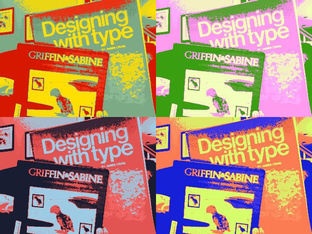
Designing With Type: A Basic Course in Typography
Griffin & Sabine Tenth Anniversary Limited Edition

We provide quick shipping service to all our customers. You chose USPS Standard Mail shipping, your book should arrive within 4 - 14 business days. The Postal Service may occasionally take slightly longer to deliver your book.

At this time, we are not able to offer tracking on our USPS Standard Mail shipments.

If you have any questions or concerns, please email my friends in Customer Care at help@betterworldbooks.com. If you could please include your order number (-----) that would be very helpful.

Eagerly awaiting our meeting,

Designing With Type: A Basic Course in Typography
Griffin & Sabine Tenth Anniversary Limited Edition


... and that's how it ends. Seriously.

It's a bizarre business transaction, that's for sure. But it's kind of quirky and quaint and entirely charming, too. These little business strategies are what distinguish between "good" and "great," and help build customer loyalty to the brand. If you think about it, low prices can be found anywhere -- eBay/Half.com, Amazon, library booksales, thrift stores, yard sales... but when you combine affordability with a pleasurable experience (not to mention visual appeal -- hello, website! -- and books that compliment me on my well-read self)... Well, I'll just shut up and say, "You had me at hello."

Thursday, August 13, 2009

seven: making lemonade


This is a trailer for a new documentary film called Lemonade, which captures "what happens when people who were once paid to be creative in advertising are forced to be creative with their own lives." It's a very neat idea, and really encouraging to know that there are still a million things you can do with your life if/when your five-year plan doesn't pan out. I'm finding that it's a very necessary thing to understand, especially for those looking for or hoping to work in the field of communication, like myself... (via Lemonade movie)

And a relevant quote I snagged from Frame Magazine:

Tuesday, August 11, 2009

six: does target hit the spot?

I just watched this stop-motion Target commercial posted on a blog I follow (linked below -- you should definitely check it out... very insightful guy). He brings up this really good point about technique versus concept, and which one you remember more.

Ideally, if it's a commercial, the answer should be "concept," right? That's the point of a commercial, after all... to inform or promote a brand by sparking the viewer's interest in some way.

A lot of creative agencies are great at both parts -- linking the name and the image seamlessly (TBWA\Chiat\Day, for one, have done wonderful advertisements for Apple, Pedigree and other clients)... but I'd argue that more often than not, ideas get lost in translation.

For me, this commercial gets the concept across after a couple of views (need time to absorb everything), but my mind just doesn't connect it to "Target." I register all the colors -- which is what the commercial is getting at -- but I think I'm too accustomed to Target's distinctive red-and-white, "sans serif," etc. etc. branding initiative, so this commercial reflects a different style, different brains behind the whole thing and so forth. (I guess that's why they show the Target logo at both the beginning and end of the commercial... to reinforce the brand.) "Different" is not necessarily bad, but it certainly requires more precision on the ad agency's part to make sure viewers are able to link everything together.

Would love to hear your thoughts!


Some more of my favorite stop-motion videos...


This Is Where We Live from 4th Estate on Vimeo.


(via Thinking Aloud, Love Letter to the Universe, hagebutten and emails from my friend Lydia)

Saturday, August 8, 2009

five: frame magazine


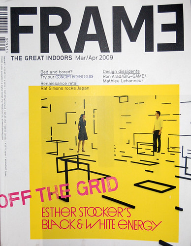
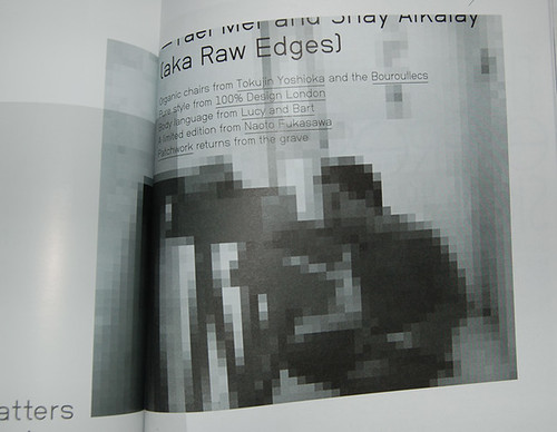
Lifted a couple shots from back issues of Frame Magazine, which is a really nice-looking trade magazine that focuses on interior and product design. I really love the innovative text styling, the graphic treatments and the way the pages are all laid out. Truly, it's a gorgeous magazine, and if you have an extra $24.95 lying about (I know, right?!), I'd recommend purchasing a copy! You can take a look at my Flickr for more photos (link).

Tuesday, August 4, 2009

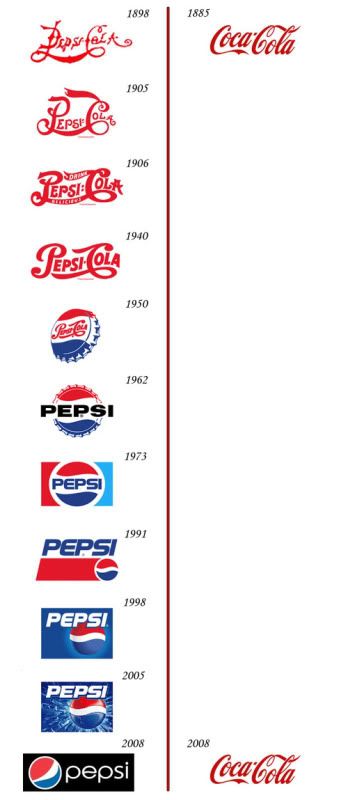
four: always coca-cola...

A funny little image has been making its way across the Internet...


I think it's safe to say that the Coca-Cola Co. (Atlanta-based, represent!) knows exactly what it's all about.

And yet. What's better, marketing innovation or reliability, stability and permanence?

Edit: There is a rebuttal from Brand New, which happens to be one of my favorite sources to read up on branding and corporate identity strategies... Evidently this little Coke vs. Pepsi graphic is inaccurate (of course it is -- it only exists to make a point, after all). For a more complete story, you should know that Coke has indeed had changes in its logo. Granted, they are minor adjustments, but to be fair, you should know that they exist all the same.

(via Swiss Miss & Brand New)

three: "this is home" project

Erin Loechner from Design for Mankind is starting a new project called "This is Home."

In a nutshell, you will:

a. write a one-sentence anecdote about "home." (I like how she calls it an "anecdote," even though it's just one sentence long. It reminds me of all of my own stories, which also typically range from one to three sentences.)

b. create an image (or two or three or ten) using any medium, based on the one-sentence anecdotes that are uploaded to the project blog.

There is some voting of favorite images that occurs, as well as some creating and purchasing of postcard packs... various different logistics that I didn't really read carefully and am now glossing over (oh, hush)...

Regardless of whether or not you submit anything, it's definitely a fun little project to challenge yourself with. Illustrate a quote, and bring someone else's story to life.

(via Design for Mankind)

Monday, August 3, 2009

two: trends in cover design

Did I miss the memo regarding the new trend in album covers or something? All set for release on Sept. 22, J. Tillman's Year in the Kingdom, The Hidden Cameras' Origin:Orphan and Hallelujah the Hills' Colonial Drones (personal fave) each happen to feature collage-style artwork on their covers.


J. Tillman


The Hidden Cameras


Hallelujah the Hills

What is the significance of this trend, and does it mean I can get a job designing jacket covers for indie/folk bands? (Dearest bands, it would be my pleasure... Please see my contact information in the column to the right.)

(via Pitchfork)