Pages

Friday, September 24, 2010

51: artsy-fartsy friday

A little over one year ago, I came up with this idea to have an "Artsy-Fartsy Friday" feature on this blog. I made one Artsy-Fartsy Friday post and then kind of proceeded to forget all about it for the next 365+ days.

So. In honor of what currently appears to be an annual feature, this post shall be a conglomeration of the fabulous music videos of the Chicago-based band, OK Go.

Let's start with their newest release -- this is for their song, "White Knuckles":


One featuring their awesome Rube Goldberg machine...


More stop motion (if you didn't know already, I have a thing for stop motion)...


Incredible choreography... This is the video that helped launched OK Go onto the Billboard charts.


Public response, according to some of the things I caught on Twitter the other day:


(via)


(via)


(via)


(via)


(via)

Whether or not you love or hate OK Go's sound, it's hard to deny that they're producing really innovative music videos with some pretty groundbreaking ideas.

Wednesday, September 22, 2010

50: screencaps from love in the afternoon

title - Love in the Afternoon

credits - Love in the Afternoon

Two screen captures of the opening credits from the 1957 romantic comedy, Love in the Afternoon (later released in Europe under the title Ariane). Keepin' it classy.

Friday, September 10, 2010

49: a critique on computer interfaces—chrome vs. safari

For those you who aren't in the know, Chrome is Google's new-ish web browser. It's fast, streamlined and simple, keeps you more secure on the Internet, and has other nice features. Now, I'm a Mac user, and for a long time I strangely took pride in my usage of Safari as a browser. None of that Mozilla Firefox or Internet Explorer nonsense—Safari all the way...until my former roommate introduced me to Google Chrome, that is. The first thing I noticed was how colorful her browser window was. Pink hearts and bunnies in the background? I'm sold. I've been using Chrome on my laptop for a few months now, and I've noticed some good and bad aspects about it.

the good

The themes, obviously. Sounds funny to say, but having a little color and a taste of your individual aesthetic in your browser makes your Internet experience that much more personal. Switching from Chrome to Safari actually feels like going back in time—shocking, I know. But Safari is just so monochromatic; I never want to stick around for too long for fear of all the gray and black sucking out my soul. With Chrome, it's also really nice not to have to download an add-on just to have browser themes (like you have to do with Firefox). It might seem like a tiny little 2-minute step, but it's still 2 minutes of my life that could be spent doing anything else. Google Chrome makes the whole process completely painless.


Easy access to recently closed tabs. Safari has a "Reopen last closed window" button, as well as a "Reopen all windows from last session," but sometimes you don't want to be constrained to either/or. Sometimes you want to see more than the last website you visited but fewer than the fifty that were open during your last session. Chrome gives you a lot more flexibility in that respect.


the bad

Unlike Safari, Chrome doesn't have a title bar at the top of the window. It's really annoying that I can't see the full title of the page I'm looking at unless I hold my mouse over the tab, and even then I shouldn't have to find a work-around for something so basic. The lack of visibility becomes a bigger problem when I have a lot of tabs open and I start accidentally closing out windows, not knowing what exactly I just closed. I'm sure there's a way to make the title bar visible, but that would take more work than I'm willing to exert. I don't know what would possess Google to remove such a standard feature from its browser, but I'm pretty sure it wouldn't take that much more time, labor, or effort to add it back in.

Speaking of title bars, I'm really used to double-clicking the title bar to minimize my browser window. However, since Chrome doesn't HAVE a title bar, I was caught off-guard the first time I tried to double-click my windows away. I kind of stared at the screen for a while before tentatively choosing a very thin sliver of window that wasn't occupied with a tab or some other button. Same goes for just dragging a window around your screen. It takes a lot more focus to aim your mouse because that thin strip of space doesn't really afford easy access.


Easy fix—add back the title bar and give users more leeway to grab onto the window. (Really, it's like killing two birds with one stone.)


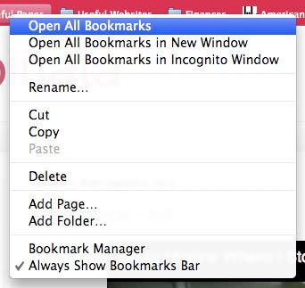
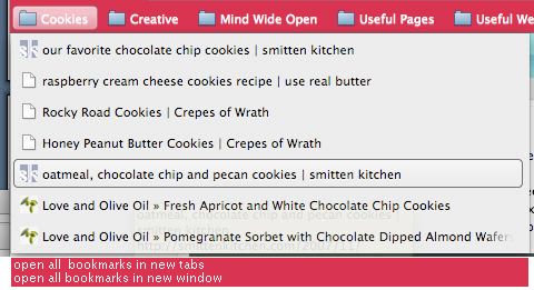
Not being able to open all my bookmarks at once. In Safari, I have the option of opening all the bookmarks in a folder with just one click, but in order to do so in Chrome, I have to right-click on the folder to see my options—this lack of visibility makes my gulf of execution a lot wider. In Safari, I'd use the "Open all tabs" feature like fifty thousand times a day, but because it's harder to see what to do in Chrome, I'm finding that a lot of the time, I just end up not using my bookmarks nearly as often.


Redesign suggestion: Add an "Open all tabs" option in the bookmarks folder, like Safari has. Or maybe even cater to us drag-and-drop aficionados, and make it so that you can drag a folder into the navigation bar, which will open up all the bookmarks in that folder.


the ugly

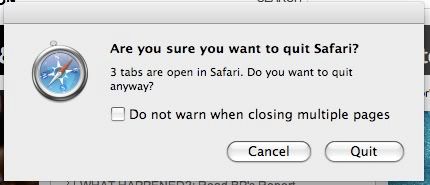
Weird secret hidden key commands. In both Safari and Chrome, Command-W is a shortcut for closing the current tab you're looking at. In Safari, Command-Option-W closes out all windows EXCEPT for the current tab you're looking at, which might actually be one of the dumbest shortcuts I've ever encountered, seeing as the Option key is RIGHT next to the Command key, which makes it so easy to accidentally close out all the wrong tabs, which I've done many times before because I have clumsy fingers. In Chrome, Command-Option-W just closes out EVERYTHING, which might possibly be even more irritating. Similarly, Command-Q closes everything out and quits out of both browsers—however, with Safari, if you have more than one tab or window open, you get a pop-up message. No such message with Chrome—if you accidentally Command-Q your way out of the browser, you lose everything and have to reopen all your "recently closed" tabs again. Redesign suggestion (or demand, really): Get rid of Command-Option-W. So useless and hazardous for the accident-prone. Add an alert for every time you press Command-Q, so that you don't accidentally/blindly quit out of everything you're looking at.

Monday, September 6, 2010

48: mixtape - fall


No album art or downloadable tracks this time -- just something to listen to while you're doing stuff on the Internet.

Tracklist:
Where I Stood - Missy Higgins
Where We Gonna Go From Here - Mat Kearney
Breathe - Taylor Swift
Buildings & Mountains - The Republic Tigers
Brown Trout Blues - Johnny Flynn
The Lengths - The Black Keys
Sleep - Azure Ray
In These Arms - The Swell Season
You Could Be Happy - Snow Patrol
How to Say Goodbye - Paul Tiernan
9 Crimes - Damien Rice
Lies - Glen Hansard and Markéta Irglová
Moon and Moon - Bat for Lashes
I Will Follow You Into the Dark - Death Cab for Cutie
Make This Go On Forever - Snow Patrol
Won’t Back Down - Mat Kearney
The Park - Feist
Bird Song Intro - Florence + the Machine

Thursday, September 2, 2010

47: a critique assignment for which i got called out for not addressing aesthetics

artifact

I'm looking at a Poland Spring's Grip-n-Flip water bottle, available at most convenience and grocery stores for less than two dollars. As far as water bottles go, this one designed fairly thoughtfully (although I did encounter some issues with the flip cap).

good elements

Poland Spring's Grip-n-Flip design differs from other water bottles in that the bottom half of the bottle curves in slightly and has textures and grooves that are supposed to help users grip the bottle more securely. The little textured bumps and lines don't actually help me hold onto the bottle that much better; if anything, the two textured sides of the bottle add a level of comfort to holding the bottle (it's almost like a massage for your fingers), and improve visibility by indicating more clearly where I'm supposed to put my fingers (in contrast, the rest of the bottle is relatively smooth). This bottle also has really nice affordances - two of the curved sections on the side of the bottle have three very subtle indentations, a perfect fit for small semi-cylindrical objects, like your fingers.

Another nice thing about this bottle is that it has a flip cap (as opposed to a twist cap) that makes it much easier for the user to drink water on the go. The flip cap's clear blue color stands out and makes it very visible to the user that it is probably an important feature on the bottle. The cap has this slight ledge that possibly affords wedging something into it - in this case, if you put your finger under it and apply a little pressure, the cap opens easily.

bad elements

If you're not used to drinking from a bottle with a flip cap, then there's probably a learning curve. It's not obvious that you have to push open the cap to drink water because there's not really a natural mapping to it; in fact, Poland Spring even lists instructions for opening and drinking from the bottle on the label because it's not intuitive. Another element that sucks is the fact that the cap pops open SO easily - whenever I have this water bottle in my bag, I have to make sure it's standing upright because it has a tendency to snag on my notebooks and leak water all over my belongings, which is really, really irritating and a definite liability.

other stuff

Of course, in my critique, I'm ignoring aesthetics (I actually prefer a smooth sleek water bottle - picture VOSS and smartwater - to one that is textured and somewhat unusually-shaped), as well as cost/sustainability (apparently Poland Spring's bottles are supposed to be really eco-friendly... less plastic is used, which means the bottle is thinner than most and more flexible, and flexibility affords bending and crushing, which is good when you want to recycle stuff, I suppose). There's also the fact that my Poland Spring fits nicely into a cup holder on a car, which is more than can be said for those square FIJI water bottles...

redesign suggestions

The label on my water bottle says, "The easy grip sports bottle from Poland Spring is designed to fit naturally in your hand, and in your life," and I think the first part is true... the latter, not so much. Some easy redesign fixes - first, add a small bar of plastic in between the cap and the mouthpiece so that there's more friction to keep the cap from accidentally being jostled and opening. Second, instead of making the "ledge" go all the way around the cap, designers could cut off part of it so that the user has a clearer idea of where exactly to push to open the lid. The smooth dip in plastic seems to be the perfect size for a finger to slide along; that simple little detail guides the users movements and actions very nicely.

As far as helping the user grip the water bottle better, Poland Spring could add bumps that are more heavily textured or made from a different material, or even add a handle, if they wanted - though some people might consider this too bulky an addition. In general, implementing these design ideas probably wouldn't cost a ridiculous amount, but it would make the product better and maybe more valuable to the user.