the good
The themes, obviously. Sounds funny to say, but having a little color and a taste of your individual aesthetic in your browser makes your Internet experience that much more personal. Switching from Chrome to Safari actually feels like going back in time—shocking, I know. But Safari is just so monochromatic; I never want to stick around for too long for fear of all the gray and black sucking out my soul. With Chrome, it's also really nice not to have to download an add-on just to have browser themes (like you have to do with Firefox). It might seem like a tiny little 2-minute step, but it's still 2 minutes of my life that could be spent doing anything else. Google Chrome makes the whole process completely painless.

Easy access to recently closed tabs. Safari has a "Reopen last closed window" button, as well as a "Reopen all windows from last session," but sometimes you don't want to be constrained to either/or. Sometimes you want to see more than the last website you visited but fewer than the fifty that were open during your last session. Chrome gives you a lot more flexibility in that respect.

the bad
Unlike Safari, Chrome doesn't have a title bar at the top of the window. It's really annoying that I can't see the full title of the page I'm looking at unless I hold my mouse over the tab, and even then I shouldn't have to find a work-around for something so basic. The lack of visibility becomes a bigger problem when I have a lot of tabs open and I start accidentally closing out windows, not knowing what exactly I just closed. I'm sure there's a way to make the title bar visible, but that would take more work than I'm willing to exert. I don't know what would possess Google to remove such a standard feature from its browser, but I'm pretty sure it wouldn't take that much more time, labor, or effort to add it back in.
Speaking of title bars, I'm really used to double-clicking the title bar to minimize my browser window. However, since Chrome doesn't HAVE a title bar, I was caught off-guard the first time I tried to double-click my windows away. I kind of stared at the screen for a while before tentatively choosing a very thin sliver of window that wasn't occupied with a tab or some other button. Same goes for just dragging a window around your screen. It takes a lot more focus to aim your mouse because that thin strip of space doesn't really afford easy access.

Easy fix—add back the title bar and give users more leeway to grab onto the window. (Really, it's like killing two birds with one stone.)

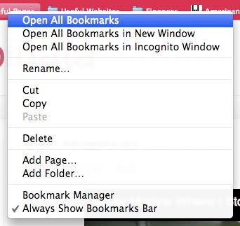
Not being able to open all my bookmarks at once. In Safari, I have the option of opening all the bookmarks in a folder with just one click, but in order to do so in Chrome, I have to right-click on the folder to see my options—this lack of visibility makes my gulf of execution a lot wider. In Safari, I'd use the "Open all tabs" feature like fifty thousand times a day, but because it's harder to see what to do in Chrome, I'm finding that a lot of the time, I just end up not using my bookmarks nearly as often.

Redesign suggestion: Add an "Open all tabs" option in the bookmarks folder, like Safari has. Or maybe even cater to us drag-and-drop aficionados, and make it so that you can drag a folder into the navigation bar, which will open up all the bookmarks in that folder.


the ugly
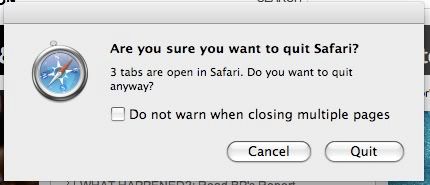
Weird secret hidden key commands. In both Safari and Chrome, Command-W is a shortcut for closing the current tab you're looking at. In Safari, Command-Option-W closes out all windows EXCEPT for the current tab you're looking at, which might actually be one of the dumbest shortcuts I've ever encountered, seeing as the Option key is RIGHT next to the Command key, which makes it so easy to accidentally close out all the wrong tabs, which I've done many times before because I have clumsy fingers. In Chrome, Command-Option-W just closes out EVERYTHING, which might possibly be even more irritating. Similarly, Command-Q closes everything out and quits out of both browsers—however, with Safari, if you have more than one tab or window open, you get a pop-up message. No such message with Chrome—if you accidentally Command-Q your way out of the browser, you lose everything and have to reopen all your "recently closed" tabs again. Redesign suggestion (or demand, really): Get rid of Command-Option-W. So useless and hazardous for the accident-prone. Add an alert for every time you press Command-Q, so that you don't accidentally/blindly quit out of everything you're looking at.

No comments:
Post a Comment