Unfortunately, it appears that not all copy-writers, designers, and companies stop to consider the full repercussions of their messages. Many seem to take a concept (weight loss, or body mass index, as you're about to see) and hone in on it to the point that they get tunnel vision. All they can think is, "My message hits the spot exactly and completely," and as a result, they end up ignoring all the other ways people could interpret the same few words.
I think that this is what happened with General Mills' Multigrain Cheerios cereal box.
The intention of the packaging is to promote good health -- and there is absolutely nothing wrong with wanting to live a healthy lifestyle -- but it does so in an extremely unsophisticated way.
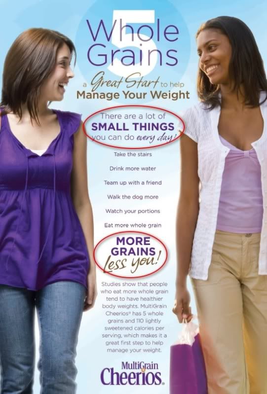
Image from Multigrain Cheerios' corporate website
Two things that immediately stood out to me:
(1) There are a lot of SMALL THINGS you can do every day!
Notice the typography: Because of the weight and capitalization of the text, the phrase "small things" is what stands out to you. It's almost as though "small" should be your focus within that whole statement.
(2) The slogan "More grains, less you!" is a clever play on semantics. "Less you" refers to less of you physically. Less body fat, less "excess," less "glut," less you.
The phrasing is certainly clever, but it is also incredibly distasteful at the same time (not that "distasteful" automatically means "bad" -- sometimes we get a kick out of things that are distasteful. Sometimes companies do well with "distasteful"). But in this case... seeing as Multigrain Cheerios are a widespread commercial product, I'd say it would be in General Mills' best interest not to offend its market, no? Whether consciously done or not, the company is promoting the idea of body as identity. You = your fat. You = your body mass. Let's aim for less you!
As a woman, I understand the importance of having the ideal weight, the perfect shape, tiny arms and slim legs. I get it. I really do. In a world where, like it or not, we are bombarded with images of beautiful people, the rich and famous, stick-thin models, all the clichéd perceptions of beauty... how can we not want -- to some extent, at least -- the same for ourselves? We all want to be fawned over, complimented, admired for our physical appearance, the shapes of our bodies, our external features...
It's okay to want to be seen as beautiful. There's nothing wrong with that. But it can become an obsession, an extreme, and it turns into an issue when we look in the mirror and see "portion control," or "double chin," or -- heaven forbid -- "more grains, less you."
The intention of the packaging is to promote good health -- and there is absolutely nothing wrong with wanting to live a healthy lifestyle -- but it does so in an extremely unsophisticated way.
Two things that immediately stood out to me:
(1) There are a lot of SMALL THINGS you can do every day!
Notice the typography: Because of the weight and capitalization of the text, the phrase "small things" is what stands out to you. It's almost as though "small" should be your focus within that whole statement.
(2) The slogan "More grains, less you!" is a clever play on semantics. "Less you" refers to less of you physically. Less body fat, less "excess," less "glut," less you.
The phrasing is certainly clever, but it is also incredibly distasteful at the same time (not that "distasteful" automatically means "bad" -- sometimes we get a kick out of things that are distasteful. Sometimes companies do well with "distasteful"). But in this case... seeing as Multigrain Cheerios are a widespread commercial product, I'd say it would be in General Mills' best interest not to offend its market, no? Whether consciously done or not, the company is promoting the idea of body as identity. You = your fat. You = your body mass. Let's aim for less you!
As a woman, I understand the importance of having the ideal weight, the perfect shape, tiny arms and slim legs. I get it. I really do. In a world where, like it or not, we are bombarded with images of beautiful people, the rich and famous, stick-thin models, all the clichéd perceptions of beauty... how can we not want -- to some extent, at least -- the same for ourselves? We all want to be fawned over, complimented, admired for our physical appearance, the shapes of our bodies, our external features...
It's okay to want to be seen as beautiful. There's nothing wrong with that. But it can become an obsession, an extreme, and it turns into an issue when we look in the mirror and see "portion control," or "double chin," or -- heaven forbid -- "more grains, less you."