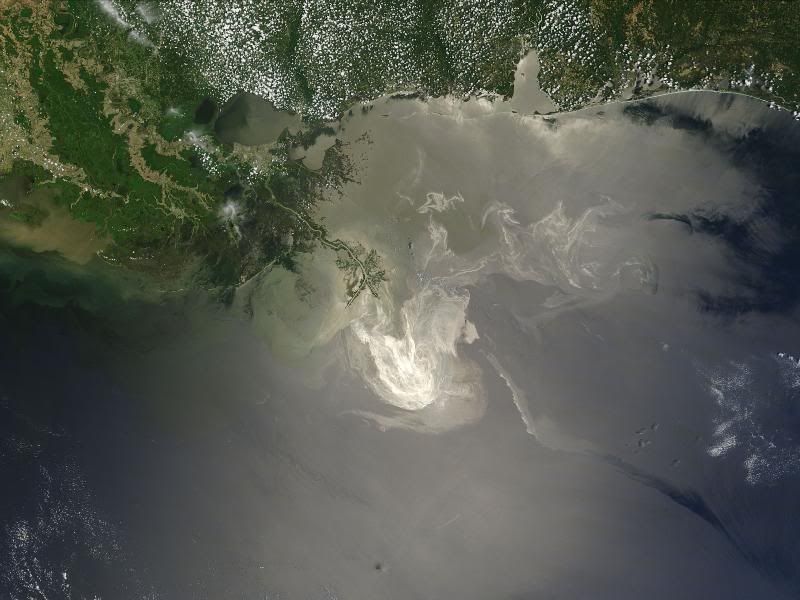
Surely by now you are well aware of the epic mess that BP has made in the ocean. It's devastating and beyond infuriating. I read this comment on an online news article, and I feel the need to share it with as many people as possible. Paul says: "I don't understand how this has been allowed to continue for so long without criminal charges. If I started to pour mass amounts of oil into my local river and lake, I'd be charged for sure. Poor animals." This point is exactly what Bruce Monger, my oceanography professor from Fall '09, keeps trying to instill in us.
Bruce runs a website/blog called It's My Ocean. I'm just going to copy and paste his post on the concept of ocean ownership, because he explains it so well:
This site is devoted to promoting a realization within ordinary people that they, as individuals, own all of the ocean and its content. The hope is that when people feel a personal sense of ownership they will feel empowered to insist that no one be allowed to mess it up.Yes, both BP and the government are getting a ton of flack for the way they are/are not handling everything, and it's leading to some crazy, crazy responses, but we can't always use other people and entities as scapegoats. It's not just about what BP has and hasn't done. It's not just about what President Obama has and hasn't done. It's also about what we have and haven't done -- what we've allowed to happen with our habits and our purchasing power -- what we haven't protested or stood up for.
The analogy I give to the students in my oceanography class at Cornell is that lots of people in the world who read about an oil spill in the ocean will often react the same way they would react to reading an article in a newspaper about someone else’s house being broken into. They have some momentary level of sympathy for the poor guy who had his house broken into and then they move on the next page without much more thought. However, if their own house was broken into, they would be much more upset and they would scream for law enforcement to find the criminal and they absolutely would not rest until the criminal paid for the damages they caused. Well… the ocean is YOUR ocean! And when you read about an oil spill you should see it as someone spilling oil into YOUR ocean and react just as if they dumped a bunch of oil inside your house! The ocean is not owned by the oil industry. The ocean is not owned by the fishing industry. YOU own the ocean! You have a right to say, “Stop taking all of MY fish out of MY ocean!” You have a right to say, “Get your crummy oil out of MY ocean!" You have a right to say, "I am sick and tired of others coming into MY ocean and messing it up!”
The ocean is not somebody else’s property. You-Own-The-Ocean – Plain and Simple!"
That said... yes, BP is still responsible for its actions and the outcomes of those actions, which, unfortunately, are proving to be but a drop in the bucket. Greenpeace UK, for one, has had enough, and is now working on an international "rebranding" effort for the company. Straight from their website: "BP's slick green logo doesn't suit a company that wants to invest in tar sands, the dirtiest oil there currently is. We're inviting you to design them a new logo that's more suitable for their dirty business." Very scathing... and sadly, this resentment is not wholly unfounded. The entire gallery of entries can be found at their Flickr page.
I think it's safe to say that Greenpeace is running an interesting little concept, but frustration alone won't change things. People may be more aware of the BP brouhaha, but we still have a very long way to go.