Earlier tonight, I was thinking about some things I miss from home, namely a user-friendly kitchen, and easy access to Food Network so i can watch all my cooking shows. (Sure, I have cable in my dorm, but do I really want to try and navigate the 50 gazillion channels and 23948923 buttons on the remote? Yeah, not so much... but I suppose that's another post entirely.)
So anyway, all this ruminating about food, and kitchens, and user-friendliness got me thinking about the plethora of completely useless kitchen gadgets that are on the market... which in turn led me to the subject of this post: the overrated, under-criticized cake knife.
Seriously, who came up with this thing? You're supposed to be able to cut a cake with it AND use it to serve, but I'm convinced that not even the Food Network chefs themselves could properly and effectively work this thing. Let's take a closer look.
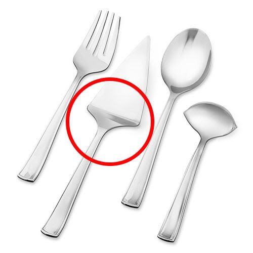
As far as affordances* go, you could say that the dull handle of the cake knife affords holding or grasping. The stainless steel affords applied pressure and getting dirty without being damaged. The pointed tip affords making holes and incisions. The serrated edges afford cutting, or at the very least, nicking a material. The slight dip between the handle and the blade affords supporting and leveraging or lifting... The functions of each element in the design are pretty intrinsic, I think.
However, while the cake knife's simplicity is a nice break from more complicated designs (such as the monster ultra-remote in my dorm), it allows for way too many conceptual models that differ from the actual, correct model -- for instance, the cake knife pictured above almost resembles a gardening or digging tool. People in other cultures might see it as some type of weapon. There are really just too many possibilities for its use.
Also, visibility† is pretty minimal -- no buttons, labels, controls or blatant indications as to how to operate the thing -- but I suppose that comes with the territory. It is a very simple serving tool, after all. In fact, because it is so simple, the minimal visibility doesn't seem to be too much of a problem. As Donald Norman says, "When simple things need pictures, labels or instructions, the design has failed." I do have to point out, though, that lack of visibility can become a bigger issue when cake server designs get more and more... flamboyant. (one, two)
There is, however one thing I really like, and that is the shape of the cake server. You'll notice it's kind of triangular, which suggests that whatever it holds should be a similar shape as well. By taking advantage of the natural design of the cake knife, the user has an immediate understanding of what the slice of cake should look like when she uses the knife.
Unfortunately, though, the handy triangular shape is not enough to redeem the design as a whole, because overall, there is not ENOUGH mapping‡ to suggest what you can actually do with the object.
Let's say you cut the cake and slide the cake knife under it so that now your slice is sitting on top of the server. Okay, then what? You can slide the knife back out; and if your cake comes out in one piece, and if the shape generally fits the server, you can tell that you've properly cut it. Instant visual feedback§, right?
But how do you get the cake off the server without unceremoniously dumping it onto its side and making a hot mess? It's not really possible, unless you grab a fork or use your finger to leverage it onto a plate... and doing so would simply defeat the purpose of a cake "server" anyway. Not to mention, there's a sanitation issue in there somewhere. Ultimately, there is just no mapping to suggest any other way to operate it.
So in conclusion, down with the traditional cake server! I think these people are of the same opinion...
Here’s a brilliant, simple solution to the problem:
Magisso Cake Server from maxwellgillinghamryan on Vimeo.
(I love the comment on the Vimeo page, about how the guy doing the demo "can't help but laugh at how simple the product is, and how rich he is going to be." It's so true -- in a technology-laden world, simplicity slips our minds... which is quite ironic, since simplicity tends to be the one thing we really need more of.)
*affordances = "perceived & actual properties of how a thing could be used"
†visibility = making controls "visible" to lead to easier use
‡mapping = relationship between two things (e.g., controls & actions)
§feedback = information sent back to user to reflect effects of an action
(via Swiss Miss)
No comments:
Post a Comment