

Surface Magazine, a really progressive-thinking print publication with an emphasis on style and design, comes out six times a year, and is a wonderful source for design inspiration.
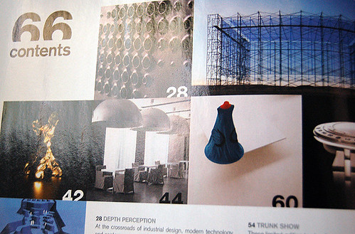
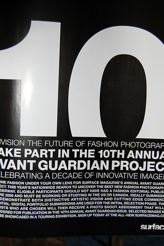
One thing that immediately stood out to me the first time I saw the magazine was its distinctive text treatment. As a play on the idea of "surface," the magazine constantly "trims" the type a little bit (you can see what I mean in the first and third pictures I posted). It's not a design element I commonly see, but it's definitely dynamic -- keeps things interesting.
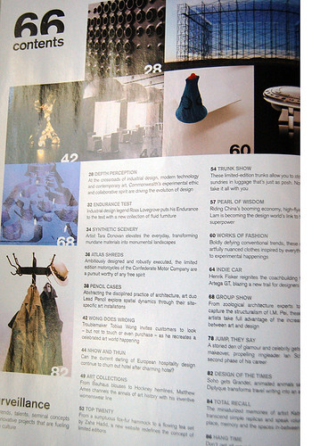
Also just wanted to point out the neat table of contents layout (fourth photo) -- I always pay attention to little structural and organizational elements, as I think it's the small details that really pull an entire magazine/layout together. Readers might not consciously notice whether or not the minor details (TOC, masthead and so forth) are consistent with the feature pages, but if they're totally divergent, you'll leave 'em with a weird taste in their mouths. People appreciate consistency, even if they don't recognize it.
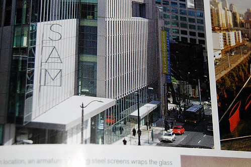
One final thing to note: I'm kind of in love with the "unexpected" text in the second and last images, i.e. the "hotel" sign and the wall type. Very cool to see designers playing with typefaces and lettering in real-life, non-print applications.
No comments:
Post a Comment