(Second photo via The Dieline)
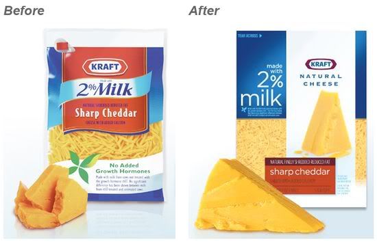
Last fall, Kraft Foods updated its natural cheese packaging to give it a cleaner, fresher feel. Goodbye to familiar lettering and vibrant colors -- hello to the new, minimal, sans-serif look. Interestingly, this same package design has now been scrapped from supermarkets, evidently due to poor sales performance.
In response to this apparent consumer snubbery of "good design," Michael Colton -- Director of Design and Strategy at Brandimage -- shares his thoughts in an opinion article on The Dieline (link).
I really love this point that he makes:
To understand design that works, you must evaluate design under a different lens than the one used to identify aesthetic beauty. Design that works seeps beneath consumer consciousness, while we are very aware and appreciative of museum quality. Design that works uses subtle visual cues such as beading water on glass or the reveal of the inner fleshy part of the fruit to trigger hunger and craving in the primitive brain. Design that works, sells volumes, while design that is beautiful is heralded in the design community.If you have some time to spare (and if you're interested in design, packaging, buying things, etc.), do read the entire piece. It's a tad bit lengthy but a great read nonetheless.
No comments:
Post a Comment