As we all know, poor design exists everywhere. Sometimes things are designed ugly, which is unfortunate, but still tolerable. Other times, things are just really badly conceptualized, and that is another issue altogether.
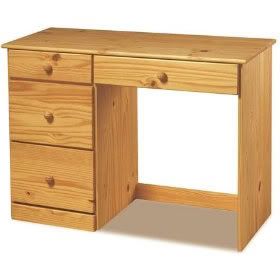
My roommate Alice thinks that her desk in our shared room in Cascadilla Hall is one very pertinent example of horrible conceptualization. When Alice does work, she's always got books open to her left and right, with handouts, notebooks and papers everywhere in between. However, her desk in Cascadilla makes it hard for her to use all her desk space, in the way that she needs to use it.
Alice: "I wish the space under the desk were bigger. I want to use the entire desk. They give you all this room to work, but since you can't move your chair very far, you can't even use it."

(via Computer Desk Info)
The entire smooth, level, wood surface of the desk affords holding materials and being written on, but the mapping of the desk makes it so that you can't even access that space effectively. The space beneath the desk affords putting your chair and legs into it; but since it's positioned under the right half of the desk, once you're sitting in the way that the design “forces” you to, you realize you can only comfortably access the right side of the desk. You really have to crane your body and neck in order to reach and see whatever notes/textbooks you put on the left side of the desk.


Alice's current solution is simply to move her chair to the center of the desk, even though it doesn't fit. It's not very comfortable, and she resents how the space beneath the desk acts as a "forcing function" that designates the way she manages her workspace. She doesn’t understand why she should have to cater to the design in the first place.
The desk is an everyday object she has to deal with. To the designer, it's probably just a simple, standard dormroom desk, but to Alice, its poor design makes it a hassle to use. There seems to be a gap between the designer's mental model of how the desk should be used, and Alice’s mental model.
However… based on what Donald Norman has to say about designers pleasing their clients (who may or may not be the end users themselves), I suppose this issue of poor design is, in a way, to be expected. From a practical point of view, if they got rid of the drawers and just left an empty space for you to move your chair as you like, students would inevitably complain about not having enough storage space in their desk. If they moved the empty space to the middle and had drawers on either side, the desk would inevitably have to be larger, to accommodate an appropriate drawer size and an appropriate chair size... and let's be real -- buyers for Cornell housing know that if our desks were any bigger, they wouldn't fit in the room at all. Unfortunately, it's just like being stuck between a rock and a hard place.
No comments:
Post a Comment